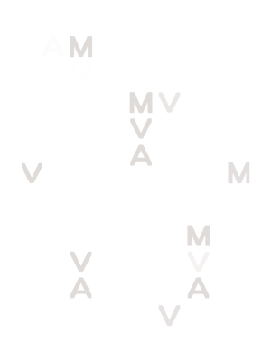
typography
Silnica
Silnica is a serif, minuscule, upright, geometric, strong and reverse contrast font I designed. This font design started as an experiment. I wanted to see if I could make a font based on a five horizontal lines. After that the whole process was based on stacking rectangles. At the beginning the font was clumsy and not balanced.
But after some modifications and the establishing of the rules based on letter groups, the font made the final version. It is a font designed for "special occasions", because it is not easy to read and it has a strong visual identity.